Showing posts with label Planning & research. Show all posts

Friday, 6 May 2016

Double page spread write up

Sam Clarke was voted the best DJ of this year. He has just released new album “Metronome” expanding on his trance style. He’s never shared much about his personal life, so last week he opened up to us for a casual Q&A!

What made you want to become a DJ?

“When I was in my 20’s, dance music was always been played around the city which made me fall in love. I was rarely seen without my walkman! I was always that kid at discos that would dance all night. I felt like music was my life, and I needed a way of expressing my feelings. I always wanted to become a DJ, but life got in the way. I was bullied at school for being shy, so music became a coping mechanism. I bought myself a cheap mixing desk and it started from there. Over time, I created a lot of music and I was learning new skills everyday (thanks to YouTube tutorials) and I kept buying more expensive equipment until I had a full on set. Don’t get me wrong, it wasn’t easy, and I made a lot of mistakes, but I was determined.”

What was your first job as a DJ?

“My very first job as a DJ was working with a business called “The Silent Disco Company” in New York. I was basically working as a sound technician, and helped set all the DJ’s equipment up. After a few months of working here I plucked up the courage to ask the owners of the company if they’d listen to my music as I had been DJing for 3 years before I got this job. It took months for them to agree to this. Eventually they finally let me perform to them in their studio and they looked amazed. They said that they wanted me to be part of their DJing crew immediately and not before long, I had been working there for 3 years enjoying every minute of performing to crowds of people. Over time I realised I wasn’t covering everything I loved about DJing. I was only mixing and remixing current tracks for people to dance along to, but I wasn’t able to release any of my own creations. I wanted a bigger crowd at this point and my ambitions were growing.”

Good for you man. Tell us how you made the leap?

“I had a meeting with the owners and I told them the truth that I wasn’t happy and that I wasn’t fulfilled as much as I could be. I asked them if I could release my own music to the crowds, but they wouldn’t let me. There was a long silence before one of the owners named Jack suddenly said “Sam, I see a lot of potential in you, and I feel like we are restricting your journey and your passion if we keep you here forever, and especially if you aren’t enjoying it. You need to get out there and be famous, if that’s what you want. I think you could do it.”  My face lit up, and I asked how I could get out there, even though the thought made me feel so sick. The other owner named Joe by this point was staring at Jack saying “What? He is our best DJ, why would you get rid of him?!” (laughs) “So then Jack said “Leave this to me.” I nodded, Joe shook his head and the meeting ended. I couldn’t stop smiling.

A few months later, Jack sat me down and said that he had been in contact with his local friend who owned a nightclub not far away called “Cielo.” Boy I love that club! My jaw fell, as that was one of the most popular nightclubs in the NYC area, and I couldn’t believe it. Jack said that his friend wanted me to perform for 2 nights in his club the following week to see how I did and to see if other people liked me. If they did, I could stay in that club. Joe said that if it didn’t work out they’ll accept me back. I put my mix together and I was nervous, but my confidence had grown I was nervous but my confidence had grown so much I wasn’t afraid.

Both nights went savage. People kept coming into the club and before long it was completely full. I had never felt so much passion and love, and I felt like I was floating and being lifted. This was my passion, and it was my job. I had tears of joy. I couldn’t wait to perform in this club again. The next day I had a meeting with the owner, and he said that I was more than welcome to join his team. I was overjoyed. Joe, not so much.

Sounds like such a high. How did it go from there?

“I had been performing at this club for about a year now, and I met a beautiful girl at the club named Gillian Hadid. She looked like a model. Man, she was gorgeous. She stayed right up at the front of my whole set, making loads of eye contact. I don’t remember how I managed to focus and mix without making a mistake if I’m honest. After my set, we went off outside and had a chat. She was great, and we got to know each other really quickly by going on dates in our free time.

Not before long we became a couple, and because she was a famous model paparazzi found out about it so fast. Quicker than the rate of fire in my opinion. It was so fast that I became scared about sharing my life in front of the world and wondered if she was worth it, but she was.

Gillian suggested that I make a YouTube channel to upload all of my tracks and videos. I loved using the computer to show off my creations, and eventually I had a good amount of subscribers. Vevo contacted me and asked if I would like to have some music videos filmed professionally, and of course I agreed. My record label “All Night” was created, and I also got asked to perform in other clubs in the area as well such as “Amnesia” and “Le Bain”.  I’m telling you, seeing people dance to your songs is the best feeling in the world”.

So tell us what else is Sam Clarke in to?

 “I own a plane, and flying is something I have always loved doing ever since I was a teenager when I took lessons and got my license. When my job became serious I wasn’t able to fly as much, but I’m free to do it more often now. I love taking friends, family members and especially Gigi up. Everyone loves it.”

What have you been up to recently and are there any projects you’re currently working on?

“Of course my wedding, but besides that I toured Eastern Europe last summer. Those Bulgarian clubs were mad. I’m still currently performing in clubs, and I’ve made it into the top 10 dance tracks eight times over the last two years. I released my latest album right before the tour, and I’m wondering what will happen next”.
What is your advice for young people out there?

“Take me as inspiration. I learnt how to DJ and I became successful when I was in my late 30’s which is unusual in this day and age. Let that show you that age isn’t everything and nothing is restricting you. Do what you love and try it. It might not work out, but at least you can say you gave it a go. Be open to every opportunity, it will build who you are. Gain confidence, and find something that you love. If there are difficult times, music will always be there”. (Laughs)


Purchase brand new album “Metronome”- £10.00-HMV 

Wednesday, 27 January 2016

Focus Group

In my focus group, I asked 4 people to tell me their opinions on my contents page and two draft front covers. On the contents page, they liked the paint splattered on top of the main image, but they thought that the image could be slightly smaller, as the page looked slightly squished and crammed. At the top of the page in-between the words "Neon" and "Contents" I put the words "Jan 2016". Someone said that it felt in the wrong place and squished, so I could move it somewhere else, such as on the right hand side where the editor's note is, and instead of the word "Hey" in the top green box, I could get rid of that and put the "Jan 2016" there. They said I could write the "Hey" in line with the first sentence.

2 people said that the green stripes over the editor's note made it look as if the stripes were sectioning off different paragraphs, but that wasn't the case- it was one paragraph. One person suggested that I tried the stripes in a different colour, or make the font of the editor's note bigger so that the words would fit better, as well as trying the font in different colours to see which colour showed up the best.

On the left hand-side someone said that I didn't need to write "Pg" after every feature. They suggested that I just write for example "How to get fit for summer...12-13" Instead of "How to get fit for summer pg. 12-13". This person also agreed that making the main image smaller would work better, although they didn't feel the image said very much, and a photo of a clubbing scene might be more appropriate in their opinion.


I made two front covers so that people could let me know which one they preferred. The first one had a lot more writing. Everyone said that the picture needed to be lifted higher up nearer the mast head, as there was a lot of space around the mast head. They also said that I used all of the different neon colours written in the mast head in other cover lines around the magazine cover apart from green, so I should change some cover lines to the same green as the colour in the mast head, just so that the cover looked more balanced. Some cover lines were written in white which were near the shirt in the main image, which made the writing difficult to see, so I'd have to move them around, change the colour or change the font size. One person said that they didn't think that the secondary images were needed. Another person said that they think only one photo should be left on the page, but with a obvious link as to what the photos are for, eg. linking text about that celebrity.


In the secound front cover, there is a big blue stripe going across near the bottom of the cover. I also didn't crop the main image as much as I did in the first draft. I also lifted the main image higher, which everyone said worked better, apart from one person who said that it looked a bit crammed, so I could lower the image down slightly more. Two people said that they didn't like the pink border around the other secondary images on the right, whereas one said they liked it, as it made it stand out due to the mast head- "Neon". The quote "Laugh Dance Party" should be lowered slightly, so that it doesn't looked so squished next to the mast head. Everyone preferred this cover apart from one person, as they thought that the first had too many words.


Saturday, 23 January 2016

Flat Plan


Here is a flat plan of what I would have inside a complete magazine. Obviously the whole magazine won't be completed, but flat plans are a great base to make sure that you know exactly what type of magazine it is going to be so that you can understand your magazine as much as possible, including things to write about in the contents page, how long your article will be and can even help with the design/style of the magazine. From doing this plan, I now know what I would like and not like inside my magazine, and has given me a idea of who this magazine is aimed at.

Wednesday, 20 January 2016

Contents page Draft


I wanted a similar theme to the front cover to show that they are the same magazine. I think the colour scheme makes the reading easy to read. I also used lots of photos as I didn't want too much writing.

Monday, 18 January 2016

Draft Of Magazine Front Cover

Here is a final draft idea of my Dance music magazine front cover:


I decided to use bold fonts and lots of writing to make it look as if the magazine is jam-packed. I used these colours because I wanted them to match the magazine name "Neon". I've included some secondary images as the main image is very simple. I also inserted a bar code at the bottom corner to make the magazine look more realistic.

Sunday, 17 January 2016

New Magazine Photos

When I took my first photo shoot for my magazine images a few weeks ago, I was really happy with them. They looked very professional and posed, as I used a white background and the DJ was wearing smart attire. However, when I actually went to make the magazine front cover, the image didn't quite match the style of magazine I was going for. My magazine genre is dance and the title name is "Neon" and the image I picked would have been perfect in an Indie or a fashion magazine. Automatically I realised that I needed to have a more fun, relaxed or colourful photo on the front cover, so I decided to take some more and that I could use the previous photos in the double page spread. In this shoot I decided to dress the model in a funky tropical shirt with headphones around his neck or on his head, as well as having sunglasses on his head, around his neck or on his eyes. I stood him in front of different backgrounds, such as a cupboard and a bookshelf. I also took some images of him holding some vinyl's to give the images a sense of style.


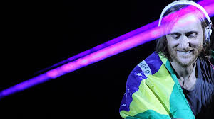
This is my favourite image and I think I'll use this for the front cover.


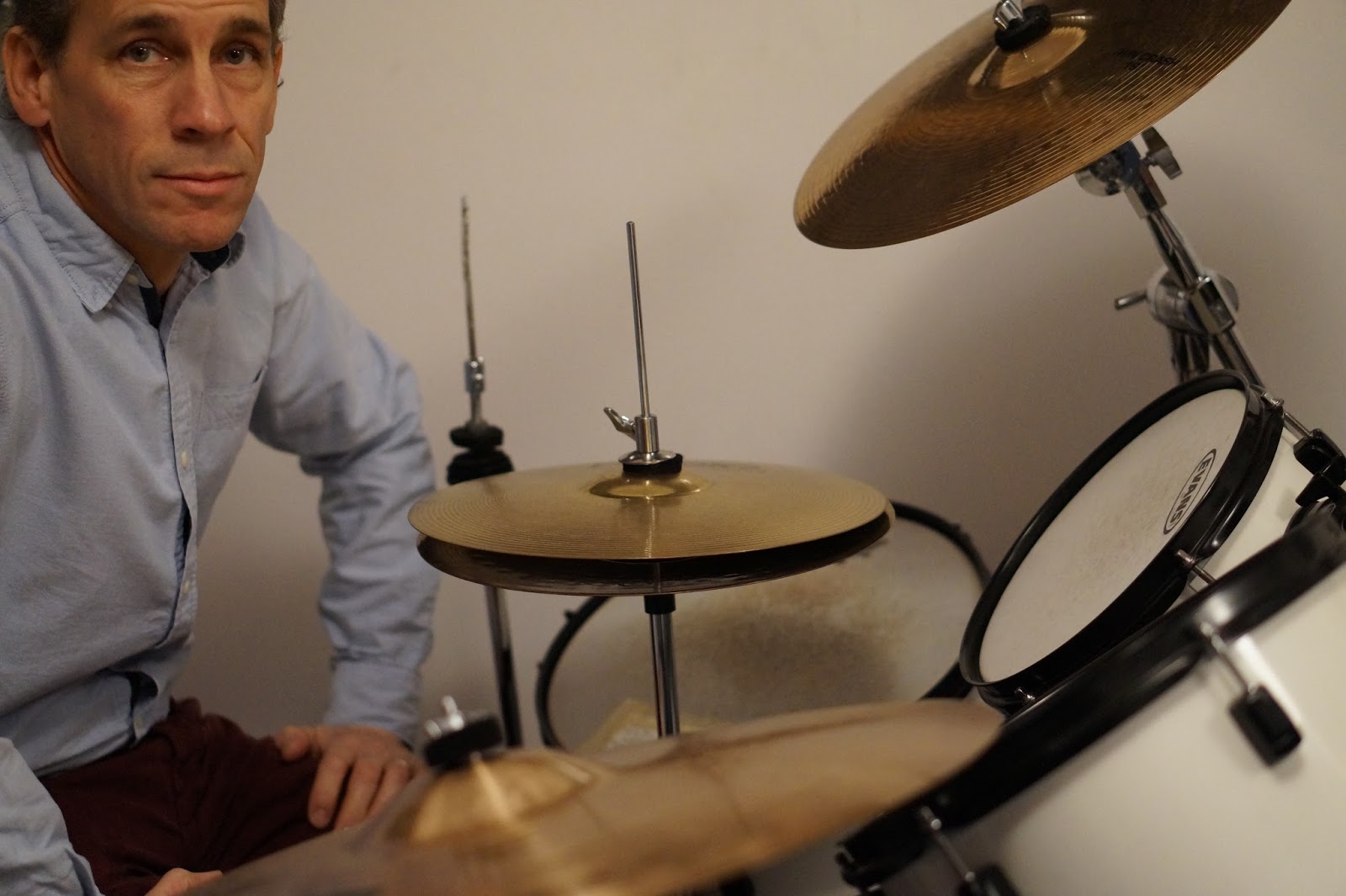
In the double page spread the interviewer asks the DJ what his other hobbies are, and he says he enjoys flying, so here is an image I can use that will link with that text.

Thursday, 10 December 2015

Magazine photos


After doing some research, this is my favourite style of a contents page layout, as I like the visuals of having more than one photo and easy to read points.


I like the style of this photo because of the simple background, but with the pop of colour in the light and his clothing. I think it would be a good double page spread background image and have the writing on the left hand side.


This is my favourite image for the front cover. I'd keep the image in the centre with text on the right and left sides.


This is my favourite image which I could use for the contents page with the text on the left hand side.


Close-ups to show personality and to show emotions-making this more personal.


I like this image, as it looks relaxed and fun- a photo that wasn't meant to happen within a photo shoot.


Other front cover main image ideas...


Interview style
I like this image, as I feel that it could be used in the double page spread.

Double page spread layout idea


Masthead ideas


Monday, 7 December 2015

Analysing: "The Devil in I" From Kerrang magazine

This double page spread from music magazine Kerrang is set out as an interview, and has a dark and Gothic style due to the colours, main image and language used. On the left hand side of the spread there is an image of the artist that this article is about, and on the right hand side is where the article is. There are three columns, as well as a pull quote: "I wish there wasn't this inner darkness." This draws the audience in as they want to know what the inner darkness is; they might relate to her. The title "The Devil in I" demonstrates the Gothic theme, and it makes the audience want to know how and why this artist has the devil inside of her. At the top right hand corner is the band name "New Years Day" in which this singer is in. If a reader was flicking through this magazine and saw this band name, they might be familiar with the name or they might be a fan themselves, so it will make them want to pick this issue up. There is a sub-heading mentioning the band name again, as well as their newest album name. It also talks about how this artist has had "traumas" throughout her life, making readers want to know what the traumas are. The Gothic theme has come up again: "She reveals the traumas that turned her world new grave."

Throughout the text the artist's name, band name and latest albums are mentioned a lot, as well as revealing song titles and phrases. This makes readers want to go away and listen to these songs, as the article describes why these songs are great for certain situations. It also talks about this artist's life, and how she became a singer and why she has a Gothic look and style to her. Because this magazine mentions her past, films and previous jobs she's had makes the audience fully aware of why this artist is the way she is, as well as creating a realistic and interesting interview article.

The colour scheme for the double page spread is white, black and red, which are colours relating to horror or terror. This could reflect on the artist's dark personality, and also the heavy music that this band creates. The title has a bold and wide font, but the word "Devil" is much bigger, is in a different font and is in red to make it stand out even more. The font is in caps lock, which is like shouting and it has a medieval feel to it, due to the embellishments on the letters. This font does look slightly old-fashioned but not too much- it still looks modern at the same time. The background has black spots dotted everywhere randomly around the page to make the pages look old fashioned or ripped, referring back to the Gothic theme.

The image on the left hand side is of the main band member in the band "New Years Day", which is placed in the centre of the page. She is wearing a black cape over her head with a velvet texture. Her hair is dyed red and black (reflecting back to the Gothic theme and matching the colour scheme), as well as having black pouring from her eyes, creating a creepy and scary look to the image, showing that she has a Gothic style shown in her personality, the way she dresses and her style of music played in her band. She also has red and black painted fingernails and she has tattoos on her hands, giving a young and rebellious feel to the image. In the top right and left corners are two images of a cartoon moon and sun. This gives an old-fashioned, medieval and Gothic feel to the image, so it looks like the good and bad sides of her.

At the bottom of the page underneath the text is a red text box. The title is "Blessed with a curse", and this box has inside quotes from this artist mentioning other celebrities she isn't fond of and tells the audience why she would curse them. This proves the "Devil" inside of her, and it referrs back to the gothic and witch-craft theme.


Saturday, 5 December 2015

Analysing a magazine article

This article has a white background with a main image that is on the left hand side. The image is a DJ (who is talked about in the article) and he is leaning against a wall wearing lots of blue and jeans looking down in a casual manner. On the right hand side is all of the text of the article. There is no title, but a picture of a badge which says "Hello, my name is..." and they've written the DJ's name in the space. This is a creative and different way of presenting an article's title, and it also tells the readers who this DJ is. Underneath this image there is a sub-title telling the readers what this man does and where he's from.

Underneath that there is a small biography about him: his age, type of music he produces etc. In the article, there is a lot of praising for the artist saying how his stuff is great, as well as suggesting and mentioning many albums and tracks from him. There are also some quotes from this DJ to support the article's points, such as "It all becomes clear." Underneath the main text there is a small paragraph about this DJ's favourite ointments and creams, which is random and strange, but it gives the feeling of a young, relaxed and fun person. The sub-title as well as key words within the text are pink, breaking up the text, making it easier to read and making certain points stand out. The rest of the text is in black, and the font is rounded and slightly thick, making it easy to read but slightly different compared to traditional fonts used in articles.


Analysing a magazine article

The mast head of this article is "The Starmarkers". It goes across two pages, but only the end of the word goes on to the next page. The font is very round, thick, tall and easy to read which is in capslock, suggesting loudness or shouting. It is written in black. There is also a sub-title in a much thinner font that isn't in capslock. It tells the readers that the magazine chose him as a new DJ to help them out. There is no pull quote. There is no background image- just the colour white.

The main image is an image of a DJ wearing a black t shirt. He has spikey dark hair with a beard, and he has a serious blank expression looking towards the left, with his body facing towards the front. There's an interesting effect on the image which enhances the colours, to give a cartoonish effect- lots of reds and yellows. The image is in the centre, and the text is on the left hand side in a white text box with black writing, which is a very standard, common and basic font for an article. The text isn't that long, and above it is another text box which is much smaller with two images of the deputy editor of the magazine and the DJ for radio 1. The images are of two men looking straight into the camera with serious expressions. These images are close ups which are in black and white, and above them it says in the same font as the title "The Selectors" in black.

 Underneath the images it tells the readers their names and their occupations. At the bottom of the page on the left hand side says "44 FEBRUARY 2011". Within the text it doesn't tell us a lot about the DJ, and it doesn't tell us any gossip. It talks a lot about where he's been performing, his newest albums and songs, who he's collaborated with and other artists that have influenced him. On the right hand side of the page it says his name, "Jordan Peak" In the same font in white, making the readers aware of who he is as it's written right next to his image, not surrounded by any distracting text.


Underneath that in smaller writing it tells us his age and below that it tells us his key productions. After that there's a short paragraph about how he became a DJ, and then it tells us his website with a white border around the text to make it stand out, making readers want to know more about him and his music.


Analysing an article

In Mixmag's Feb 2011's issue, I found an article all about Tiesto. The main image is a action shot of Tiesto DJing on stage with pink lighting, as well as the audience being in the shot. Tiesto is positioned high up on the stage in the photo, and the audience are much lower at ground level. We can't see the audience clearly as it's very dark, so we can only see a few arms in the air. Because it's so dark, the text is located in this area of the page in white writing so it is easy to read with a black background. At the top of the page it says "The greatest DJ of all Time", which is written in black with a very rounded looking font which is in capital letters, giving the impression of someone shouting, being loud or that music is fun.

The mast head of the article is "Tiesto No.1" in the same font. Tiesto is written in white and No.1 is written in black which makes it stand out and to give a contrast. There is a pull quote on the left hand side of the page at the bottom: "Nowadays DJing is about getting creative." This quote makes Tiesto sound as if he knows what he's talking about and that he's very talented and creative when he creates his music, which makes readers want to know more about him and to listen to his creations. There are four columns of text, and the font is a very basic typical font that is easy to read. The first column is quite small, as the pull quote is located in that column. The fourth column is also small, as it's only a paragraph which finishes off the article, and above it there are three quotes that were sent in from readers: "Trance is my religion and Tiesto is my god." "The lord of trance- he makes everyone on the dance floor feel special" etc. This supports the article saying that the public agree with the magazine that Tiesto is a great well-known DJ.

The text is a write up about Tiesto's career and journey, which includes some quotes from the DJ himself: "Money doesn't buy you happiness." It includes gossip about him, talking about what people think of him and how he deals with negativity, as well as talking about his financial position. The text has some swear words in it to make it seem casual. It also includes when Tiesto performs and his latest albums and songs to make readers listen.


Planning for a double page spread in a music magazine

Here is the character that I will be writing about in my double page spread.

Name: Paul Clarke
Age: 46
Occupation: Ex DJ
Status: Just got married to model Gigi Hadid
Lives in: New York

Paul was bullied when he was in school during his teenage years and music was always an escape. His favourite genres were house, trance, hardcore, electro, techno, liquid drum and bass and garage. For his 16th Birthday he asked for a cheap mixing desk to practise on and to try out some mixing, so he saved up and he became very good at mixing and creating his own music and did it in his free time and when he wanted to escape the harshness of school life.

Over the months and years he got more equipment and by the end had a full on set that was up to professional standard. He studied music tech at college and was no longer bullied- everyone loved him because of his talents despite his shyness. When he was 17, he got his first job working with “The Silent Disco Company” as a helper to set up and get everything organised for the DJs. After 3 months, he told the company about his ability of DJing, so he performed a set to them, and he immediately was accepted to be part of the company’s DJing crew. He practised and practised and worked with the company for 3 years.

The manager of the company thought that Paul was being kept within his comfort zone to stay with their company- and even though he didn’t want Paul to leave his company, the manager knew that Paul could be big one day. He got in contact with a good friend of his who owned a nightclub nearby called “Cielo.” They had a long discussion and the nightclub owner wanted Paul to perform for a few nights the following week to see how he does, even though he wasn’t well known at all. Paul was over the moon to hear this, and the owner was sceptical because of Paul’s personality. When Paul set up and got going, the crowd went mad and Paul showed his true talent and the owner saw why he was so good. Paul’s shyness did not show at all when he was performing; he was a completely different person.

Night by night more people came into the club and the owner wanted to keep Paul in his club forever. Other nearby clubs such as “Amnesia” and “Le Bain” contacted Paul directly and he performed there as well, and not before long Paul had performed in the majority of the clubs in the area within a year. After a short time he released his own songs to the crowds and they were recognised every time he performed. He created a YouTube channel and posted all of his creations on there, and after a few years Paul got in touch with Vevo to create official music videos and releases. Paul got a record label called “All Night” and his career escalated. Paul's music is described as upbeat, catchy, hardcore, progressive and stunning. He does things from remixes to progressive chill sets to hardcore club tracks. He was mentioned in this magazine, as he has been seen a lot recently in the NYC area and everyone has been questioning where he's been and what he's been up to.

At the moment Paul is still performing, but only a few times out of the year. He went on tour last year, but this year is much quieter. Paul's most recent album was released two weeks ago- "Metronome." This album include top tracks such as "Move," "Unbelievable," "Jig", "Forever" and many more.

 Paul admitted that his biggest hobby besides DJing is flying. He goes in his plane as often as he can, taking guests up with him occasionally. He is living with his gorgeous wife Gigi Hadid. The happy couple recently celebrated their marriage. Paul is happy and enjoying NYC life by visiting local clubs and living in a luxury flat with 7 rooms. 

Photoshoot plan:
I will take many different staged shots with a white background, as well as a few paparazzi images of him shopping in the streets. I want to take some professional staged looking images to make it look realistic and official. I'd also like to take some paparazzi shots, as he has been "seen" around the area recently by lots of fans. He will wear smart casual clothes: coloured chinos, casual shirt and smart but casual dark coloured shoes. I'll try some images of him wearing headphones, either looking down to the side, looking into the camera, holding the headphones or putting them on. I'll take some mid-close ups where he'll look straight into the camera with a slight smile/serious expression with his body slightly turned to one side.

 I'll also try some images of him sitting on the floor with his elbows on his knees, creating a casual atmosphere. I'll also take some of his body completely turned to one side, so we see a side-on profile. He will either look straight ahead, down or upwards. I'll also take some relaxed images of him laughing looking towards the floor. I'll also see if these images look good in black and white or colour.

Survey Responses

I created a survey asking people questions about their personal opinions to help me create my music magazine. I got 79 responses which I was pleased with, and I sent this survey around my school and on Facebook.
The questions:

Are you male or female?
(Majority- female)


What is your age?
12-16
17-20
21-25
26-30
31+
(Most common responses: 12-16: 41%, 31+ :38%)
(Least common response: 20-25: 3%)


What genres of music do you listen to?

Dance/house/trance/garage/techno
Rock/heavy metal/indie
Classical/jazz
Drum and bass/dubstep
Rap/hip hop/RNB
Country/folk
Pop
Other...
(Most common responses: Pop: 51%, Rock/heavy metal/indie: 44%)
(Least common response: Drum and bass/dubstep: 15%)


How often do you listen to music?

Never
Less than 1 hour
1-4 hours a day
5-8 hours a day
Over 8 hours
All day
(Most common responses: 1-4 hours a day-51%, less than 1 hour: 34%)
(Least common response: Never: 0%)


Where do you buy magazines?
I don't buy magazines
Supermarkets
Newsagents
Other...
(Most common responses: I don't buy magazines: 47%, supermarkets: 34%)
(Least common response: Other: 10%. Majority of answers: Subscriptions)


A new dance/house music magazine is coming out. What is your preferred title?

Neon
Bassline
All-nite
7 hours
3am
Night-life
Glo.
Move
Suggestions?
(Most common responses: Neon: 30%, Bassline: 24%)
(Least common responses: 7hours&All-nite: 2%)


Where do you buy clothes?
Topshop/Topman
River Island/New Look/H&M
Supermarkets
Ralf Lauren/Superdry/Jack Wills/Hollister/Abercrombie&Fitch
Other...
(Most common responses: Topshop/Topman: 35%, River Island/H&M/New Look: 33%)
(Least common response: Supermarkets: 16%)


How much would you spend on a magazine?
Under £1
£2-£5
£6-£10
Over £10
(Most common responses: £2-£5: 76%, under a £: 17%)
(Least common response: Over £10- 2%)


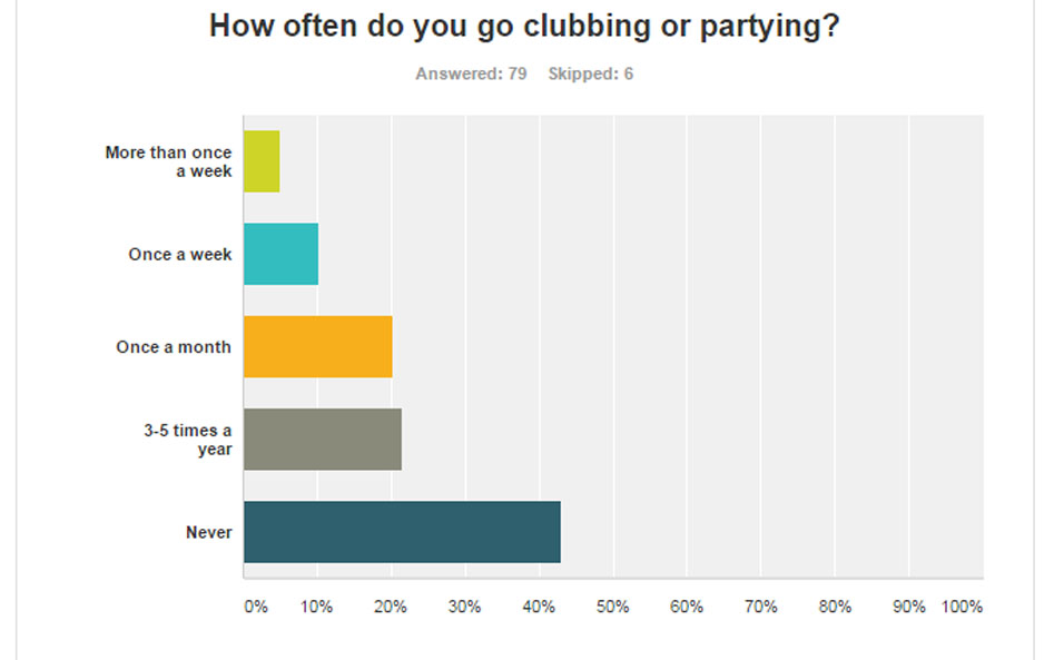
How often do you go clubbing/partying?
Never
More than once a week
Once a month
3-5 times a year
(Most common responses: Never: 44%, 3-5 times a year: 21%)
(Least common response: More than once a week: 5%)


What is your perferred content in a magazine?
Adverts
Photos
Freebies/promotions
Posters
Articles
Comic strips
Competitions
Other...
(Most common responses: Articles: 69%, photos: 54%)
(Least common response: Other: 6%. Majority said reviews)


Overall, I can see that the most common genre (Pop) is not the music magazine I'm creating, so it won't appeal to as many people. Also, I think I'll be calling the magazine Neon, as that's the most common response. I will include lots of articles and photos in my magazine, as that's what the majority of people want to see inside. My magazine will be between £2-£5, which I was suprised about- I thought people would spend less. Also, more 31+ responses came through than I expected. I also have found out that not many people buy magazines any more, and the vast majority of people listen to music everyday. This survey will impact on my magazine task, as it has taught me what people really want to see inside magazines, how often they listen to music, preferred genres, ages, gender etc. These results have suprised me, as my favourite answers weren't what the majority chose, which I found interesting.